


Digital Catalog
FORM Kitchens
- Design
- Development
- Project mgmt.
- Nestor – Project mgr
- Diego – 3D rendering
- James – Photography
10 weeks
- First version, developed
- Figma design files
- All content on CMS
- Outline for next version
Being entirely online, the FORM experience has to be seamless, transparent and easy for its clients. There was no area more important than showcasing the product itself. Since the client wasn't able to view the product in person, FORM needed readily available, beautiful photography & video as well as helpful content highlighting the product.
After reviewing the current experience and speaking with the team, there was a specific artifact being used across the client journey. The PDF catalog provided by Nobilia (the kitchen manufacturing partner).
Designed by Nobilia, it provides every product along with specific feature breakdowns. However, the photography is poor, the content doesn't reflect the FORM brand, and it includes a number of items not offered by FORM. Plus it's a PDF.
Getting started
Phases & Timeline
This was a 3 month contract, similar to the FORM marketing site contract. I already created a foundation with the marketing site, so I planned on coding earlier in the process.

Team
Like the marketing site, I'd be working solo for most of the project. However, I'd bring in specific team members to help with things like photography and rendering which were outside my capabilities.
Myself (All of the things)
Leading the project and involved with everything from research & ideation through to the development.
Nestor (Management)
Managed relationship with our 3D rendering contractor Diego. Nestor also helped pull information and answer all my questions.
Diego (3D Rendering)
Nobilia's stock folder was limited, so Diego helped produce a number of 3D renders. While not the same as a real photograph, it was close enough for what we needed.
James (Photography & Direction)
James had been taking all of the case study photography of FORM projects. He also helped photograph the Nobilia showrooms for the website.
Project Information
I spent time collecting all of the information I needed to ideate and propose a solution to the team.


key risks & constraints.
- We find the designers don’t use the catalog to improve their way of working, instead relying on existing methods like the PDFs and Slide decks
- We find that clients aren’t interested in viewing specific information about cabinetry, especially when browsing around
- [later version] We find that clients don’t want to make changes on their end (would rather tell the designer to do something)
- We aren’t able to create the right model (data or UI) that correctly maps the way designers or clients want to use the catalog
- What gets created doesn’t align closely enough with the planner, and so we end up having to re-do quite a bit of work over again in the future.
out of scope.
- Cascading configuration systems (just have a single default to start)
- System wide real-life photography accompanying every product
- Bridging single product details with the overall kitchen design (incl. in 3D environment)
undefined - In-App catalog mode, allowing the designers to more easily configure kitchens
- Installation pack integration
measurements & metrics.
Successful Outcome
- Designers bring the digital catalog into their day to day work. This could include when meeting with clients and showcasing options, configuring a client’s kitchen cabinetry, or even better educating themselves on the offerings.
- Clients have the opportunity to ‘shop a look’ from our gallery, they can also just browse our offerings to better understand what’s possible.
- [later version] Once in the design process, clients can request changes by using the configuration options in the digital catalog.
- Nobilia is impressed by the solution and wants to strengthen the relationship
Metrics
- Day to day usage rates (broken down by each feature set)
- % of projects that (at some point) utilize the catalog
- % of visitors / clients which utilize the catalog
- Length of the early stages of the design process


Homepage
The homepage provides a jumping off point for visitors. We split up the sections into the core pages, including the gallery, features, fronts, handles, and hardware. This approach makes it easy for the type of browsing we expect to happen, and we can track which sections are the most popular.
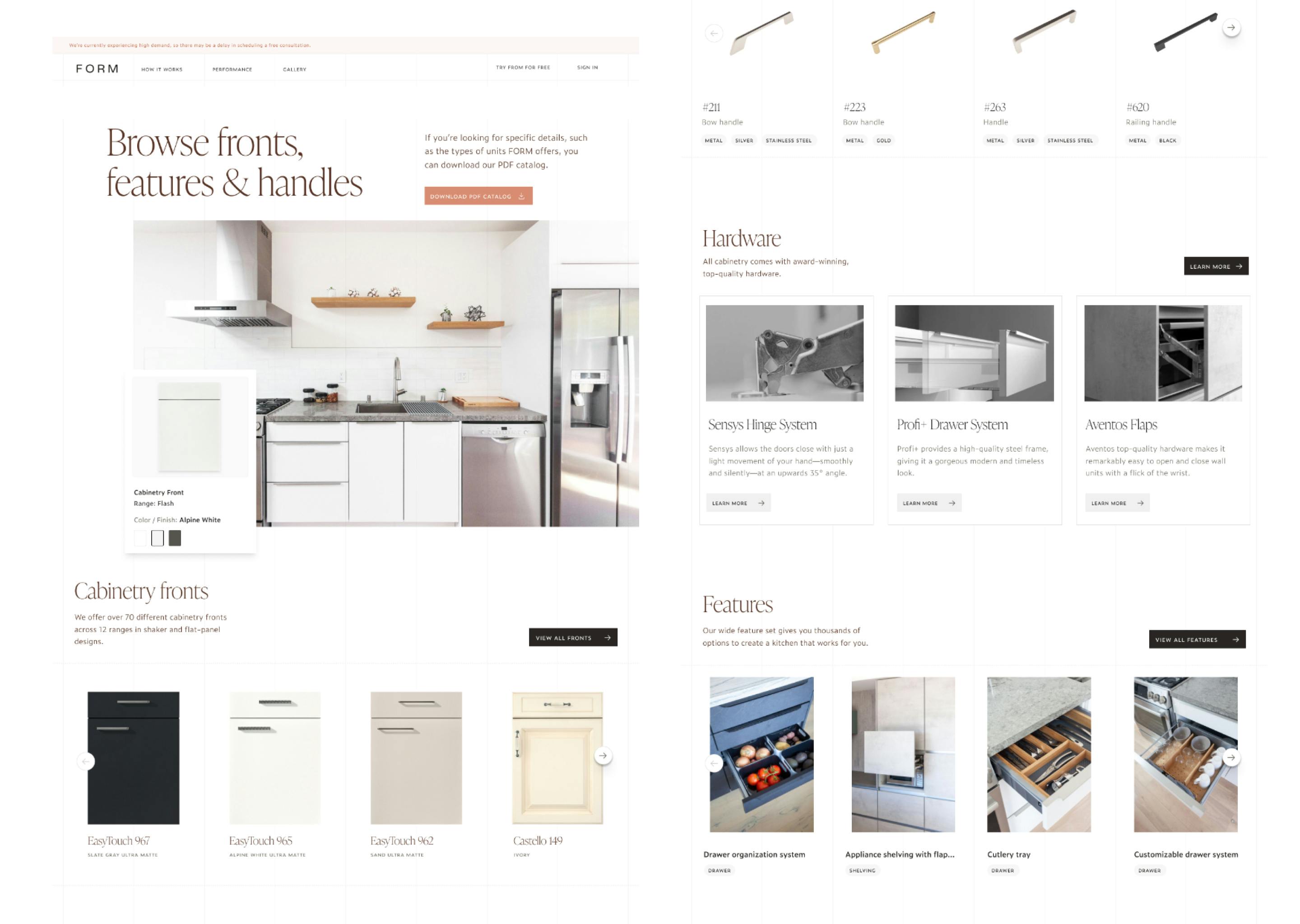
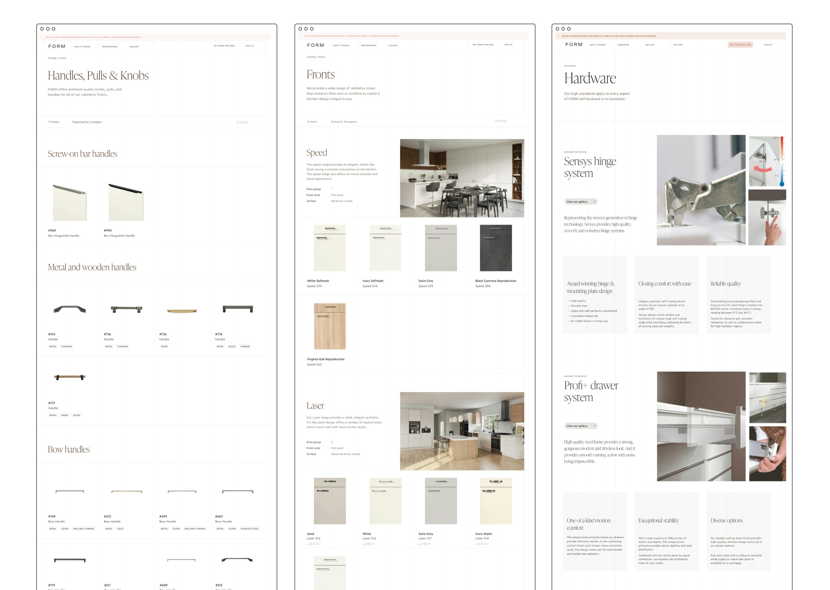
Features, handles, fronts & hardware
These 4 pages comprised the second level of the initial version of the catalog. Once a visitor decided the area of focus (on the homepage) the goal with these pages was to give them a gallery style view to quickly browse around. This allows them to get a sense of the big picture. For example, the cabinetry fronts. There are quite a few ranges and each range has a set of finishes & colors. Being able to quickly scroll through and see them all allows the visitor to decide which to focus in on.
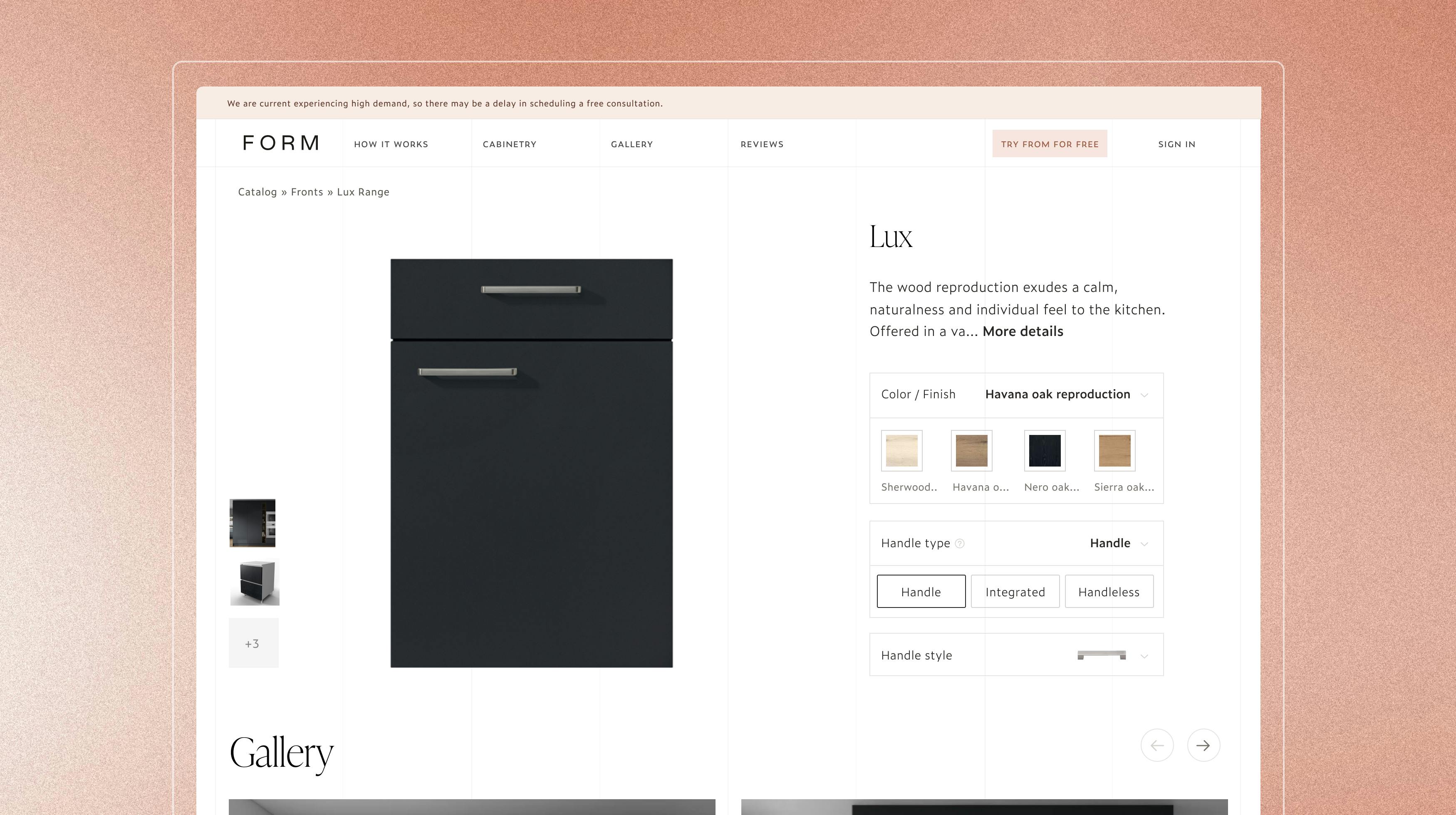
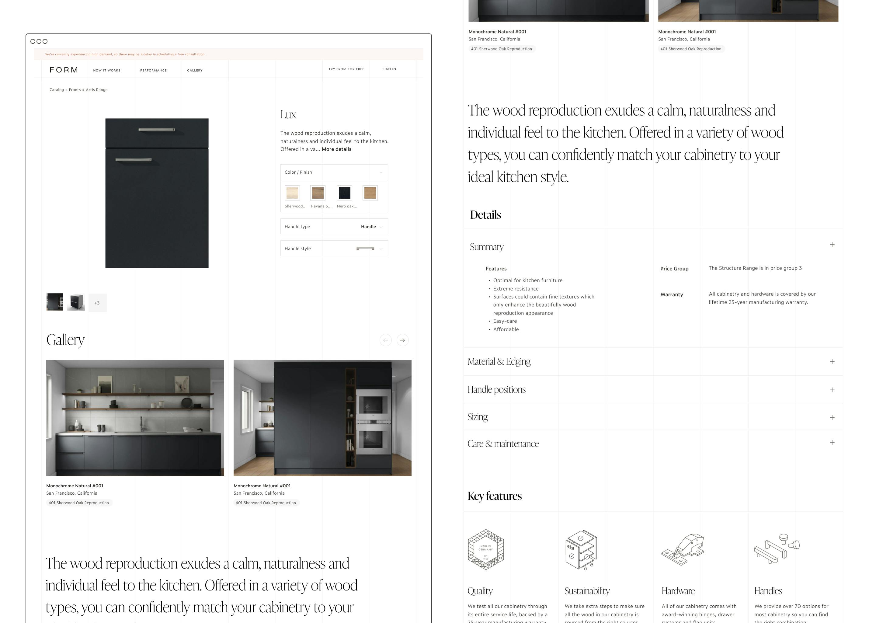
Front
This was the focus page for the initial version for a number of reasons. The cabinetry front is the biggest topic when discussing a kitchen design with a FORM client. The type, finish, materials and handle configuration can drastically change the end result.
So much so that we send all clients 3 full-sized samples once they pay the first installment. Until that happens though, the catalog front page allows potential clients to get all of the details along with multiple image types to better inform whether FORM has the right fronts for their project.
Front configuration
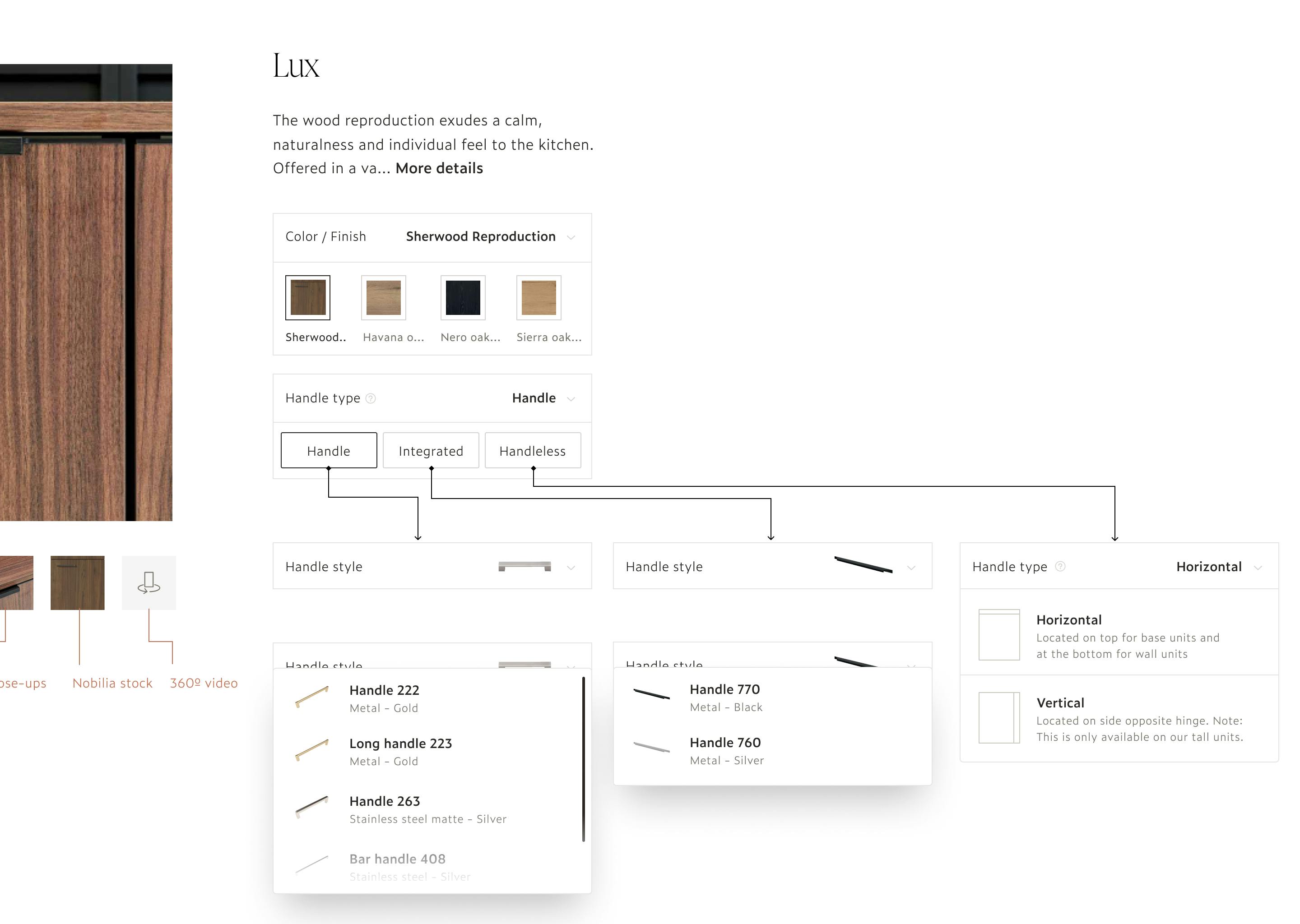
Biggest challenge: Photography
Photography
The biggest hurdle for the digital catalog was photography. Every page, especially the fronts, relied on high-quality photography that would inform potential clients if FORM was right for them. While our manufacturer, Nobilia, had stock photography available, it often fell short of FORM standards. Luckily we could lean on our own rendering photography along with a limited set of photo shoots we had completed. That being said, we knew improving photography would continue to be a priority over the first couple versions of the catalog.
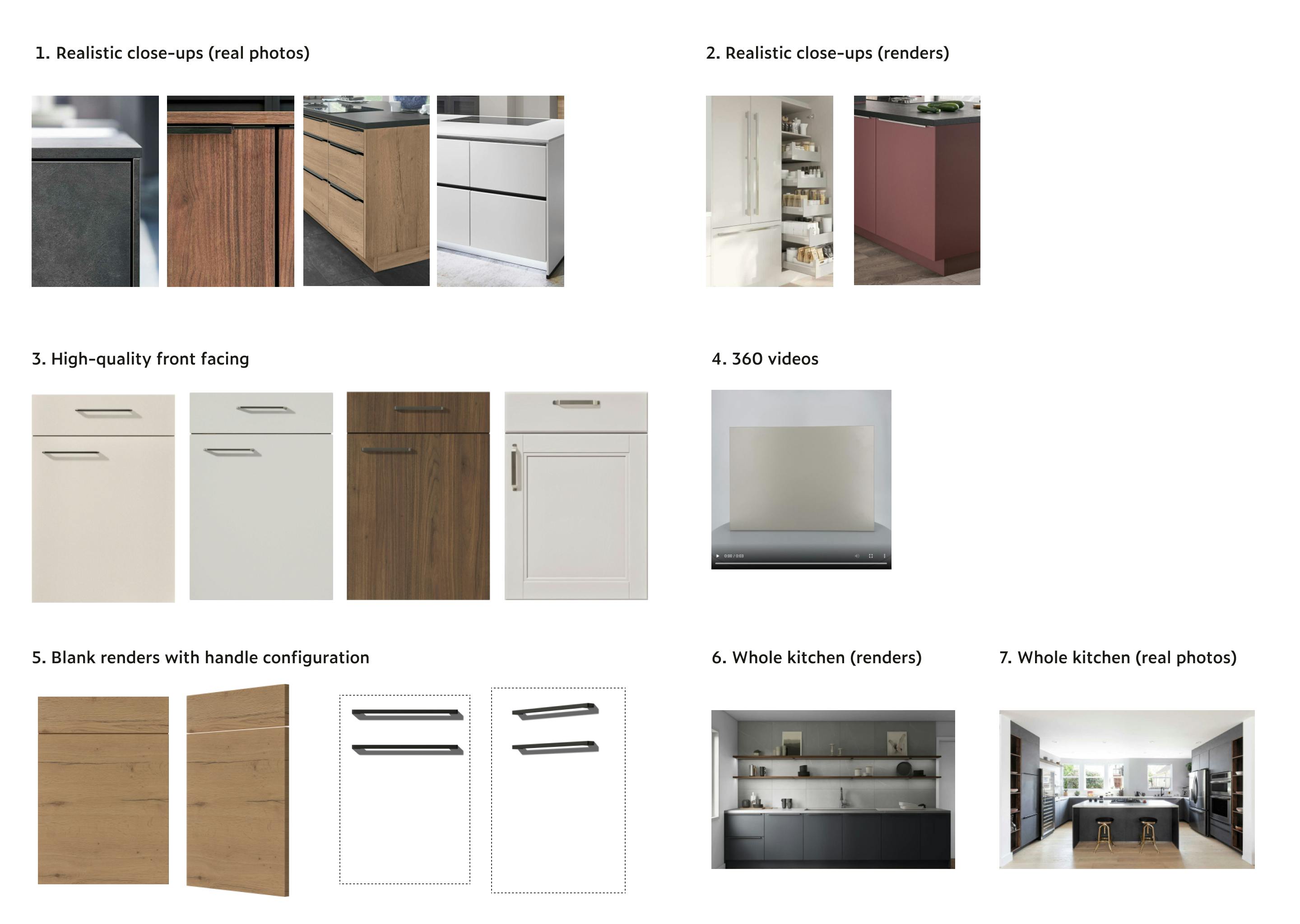
We created a hierarchy of photography to keep in mind as we built the catalog.
- Realistic close-ups (real photos)
- Realistic close-ups (renders)
- High quality front facing (of the cabinetry fronts)
- 360 videos
- Blank renders with handle configuration (From Diego)
- Whole kitchen photography (renders)
- Whole kitchen photography (real photos)
The above 7 photography types helped answer the four different perceptions our clients commonly had:
- What does X front really look like up close?
- What would X front & Y handle look like together?
- How does light impact X front?
- How does it look in a whole kitchen?
Development
Unlike my first project with FORM, I began developing the digital catalog while still designing the individual pages. One reason for this was that most of the pages were going to be similar and so I would focus on templating a lot of the code. Another was that my goal was to utilize the UI designs I created during the marketing website. And so, I didn't have to do as much exploration on the design and I could get to work more quickly.
I decided to stick within the Gatsby ecosystem, Tailwind for the styling, and Contentful as the CMS. I ended up creating a number of content models for the digital catalog and manually entering the information. While I could've utilized Nobilia's data it was configured in a way more useful to the planner application. The catalog was akin to a marketing website and so needed a different setup. Using Gatsby, I generated pages for each cabinetry range along with each front. This way we could make better use of SEO as well as make it easy to share the URLs.
Recap & Next steps
Before I departed FORM, I setup the catalog for internal beta testing with the team. The plan was to allow the designers to use the catalog with prospective clients and determine how best to use it on a client by client basis. Eventually the catalog will be a public area of the marketing website and everyone can access it.