


Website / Onboarding
Lyric
2018 | 2019
3 months
- Design
- Prototyping
- Ravi–Head of design
- Michael–Branding & copy
- Brian–Research, UI / UX
Up to this point guests could only book a Lyric Suite using a third-party provider like Airbnb or TripAdvisor. For a company like Lyric, which puts the overall experience above all else, not owning the booking experience was hurting the brand (and our overall revenue).
Getting started
We started this project just coming out of the branding phase with Design Studio. We had the overall identity but still needed to map that over to a fully-fledged online experience. We felt that the website and booking process would be a good first project. And since our team had extensive background in hospitality, we quickly outlined the marketing website and booking process. This part was a team effort. It was important to get everyone on the same page, even if the outline was still loose as it gave me more confidence to head off and get to work.
Parts of the outline included: It would be designed for potential guests as well as existing. There would be marketing pages highlighting the overall Lyric experience as well as individual pages highlighting the properties and suites. A guest could book their stay & manage it all online. In the future they would also be able to customize their stay, make in-room requests on-demand, and quickly access city-wide benefits.
Process
My role was short-term. They wanted someone to research the industry, audit existing websites & booking experiences, speak with our target personas (business travelers) and wireframe out some proposals. Once complete I was moving back onto the Wheelhouse Team to continue helping revenue managers run their short-term revenue businesses.
Research
The first step was speaking with key members of the team, especially those with hospitality experience. I wanted to learn their paint points & delights when traveling & staying places. Next I spoke with a number of business travelers, mainly those who were still traveling on a weekly basis. Funny enough, a few I spoke with were on trips and could speak to moments that happened the very same day.
I then did an extensive audit of the travel industry—accommodations, flights, rentals. I then printed and laid out many of the processes so that fellow team members could better understand & see common patterns.
I also spent a week traveling with our Head of Design & marketing lead to a number of different locations & hotel brands to better understand the full experience from booking through stay.
Design
The first step was outlining the different steps in the online process. I outlined the proposed marketing pages as well as the booking process. I made notes of potential additions for both and areas the competition fell short.
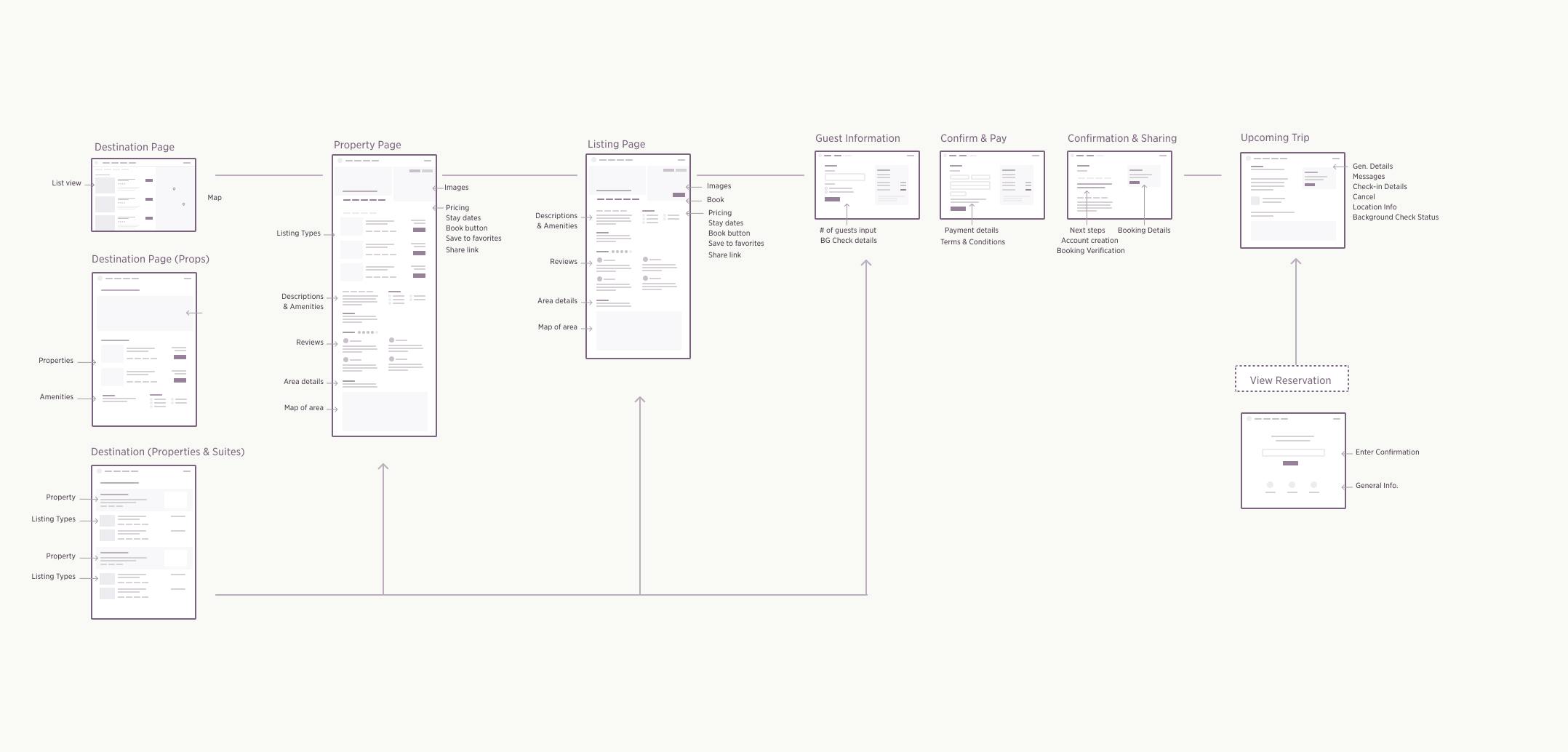
I laid out the booking process and noted the information we'd want to display for each. The steps included:
- Search
- Browse
- Analyze
- Book
- Review
In addition, I provided a breakdown of features the team should consider, broken into three versions. We wanted to get the first version out as soon as possible, so things like multi-room booking, room personalization, and loyalty programs would have to wait.
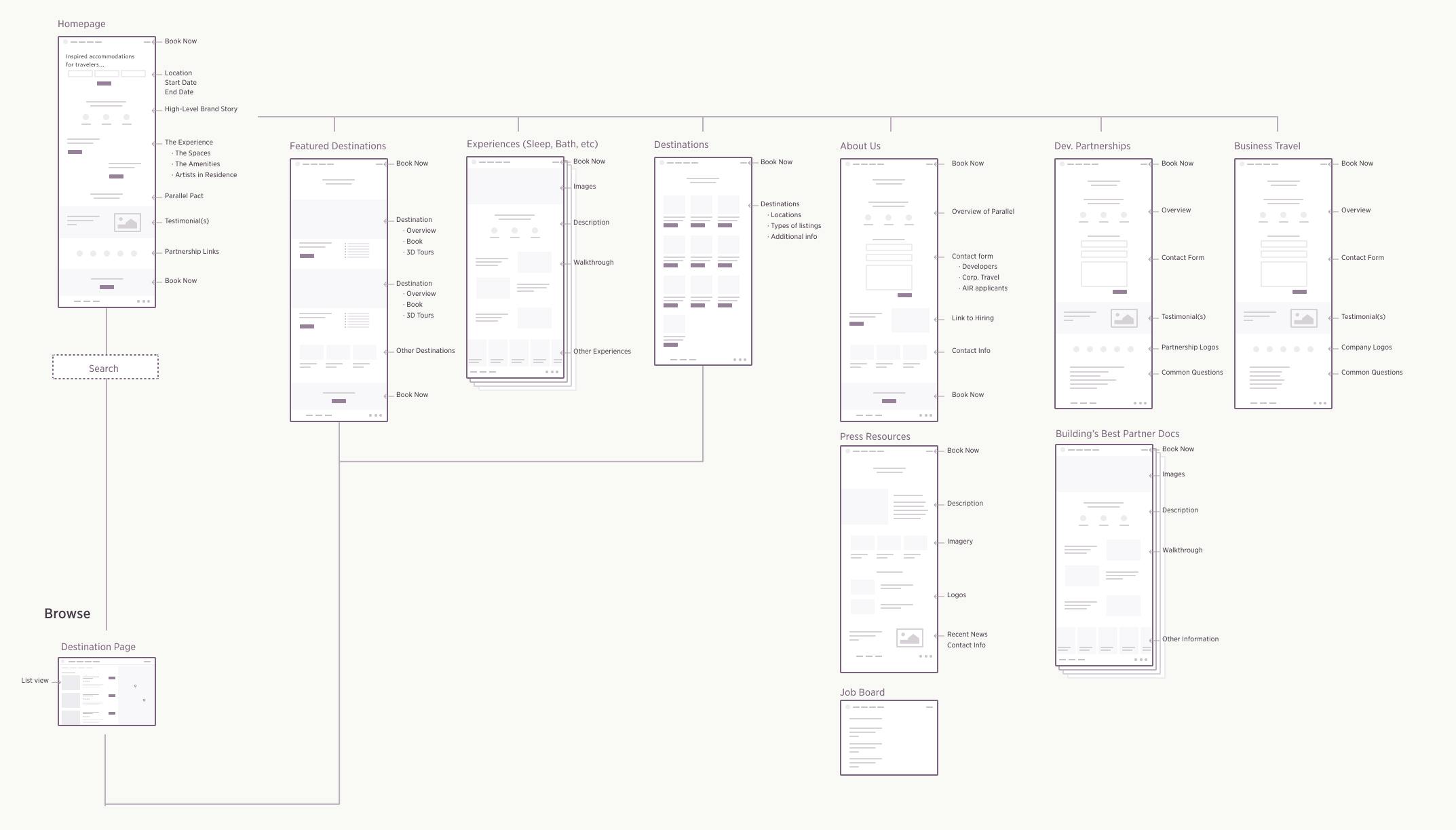
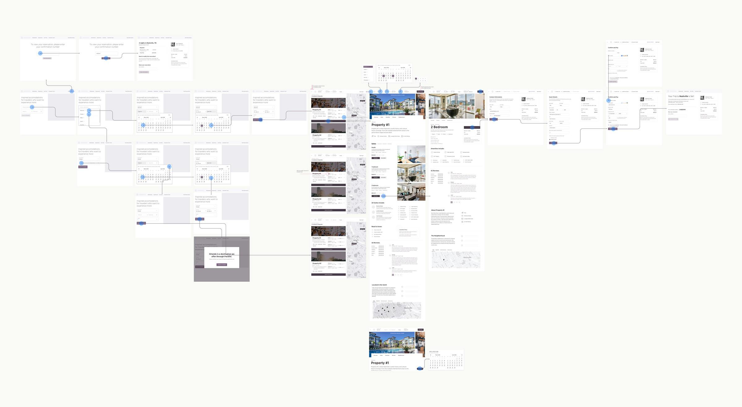
Lyric sitemap
Lyric sitemap
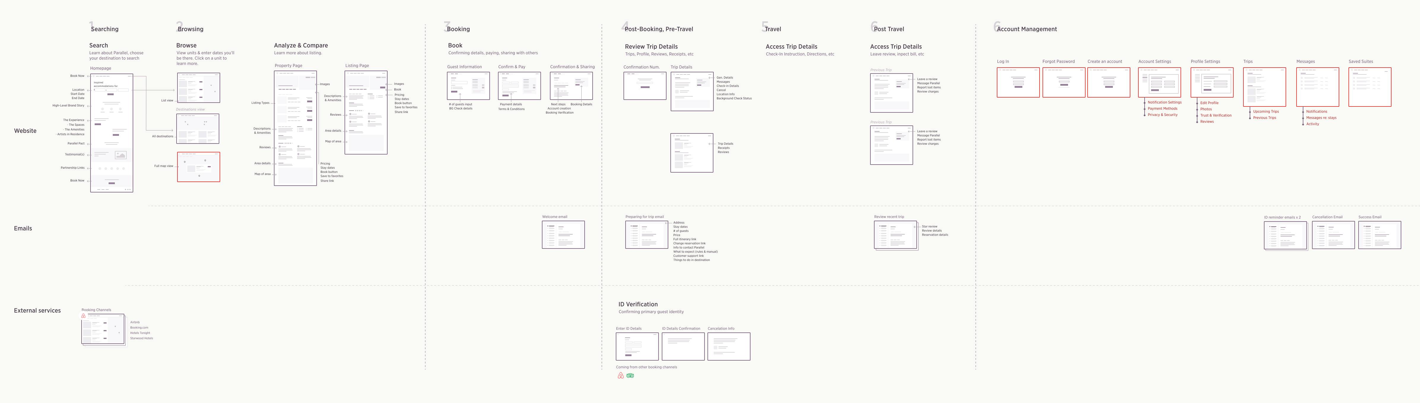
Lyric site journeymap
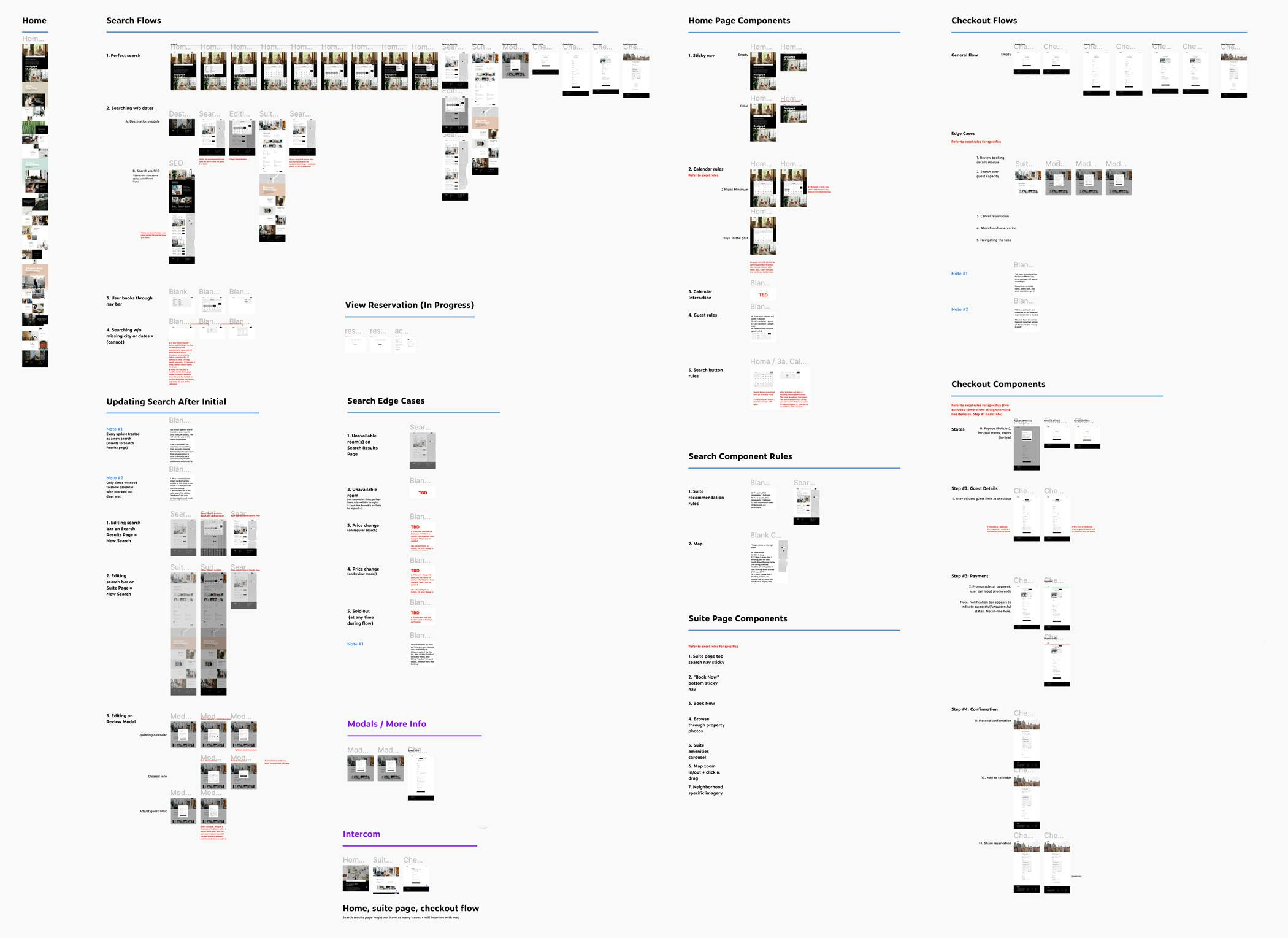
Bird's eye of the wireframes
I created end-to-end mock-ups for both desktop and mobile. Then I wired them up to prototype with the team and business travelers. I wanted to stick with a level of fidelity that focused more on the content & layout than styles & imagery.
Bird's eye view of desktop flow
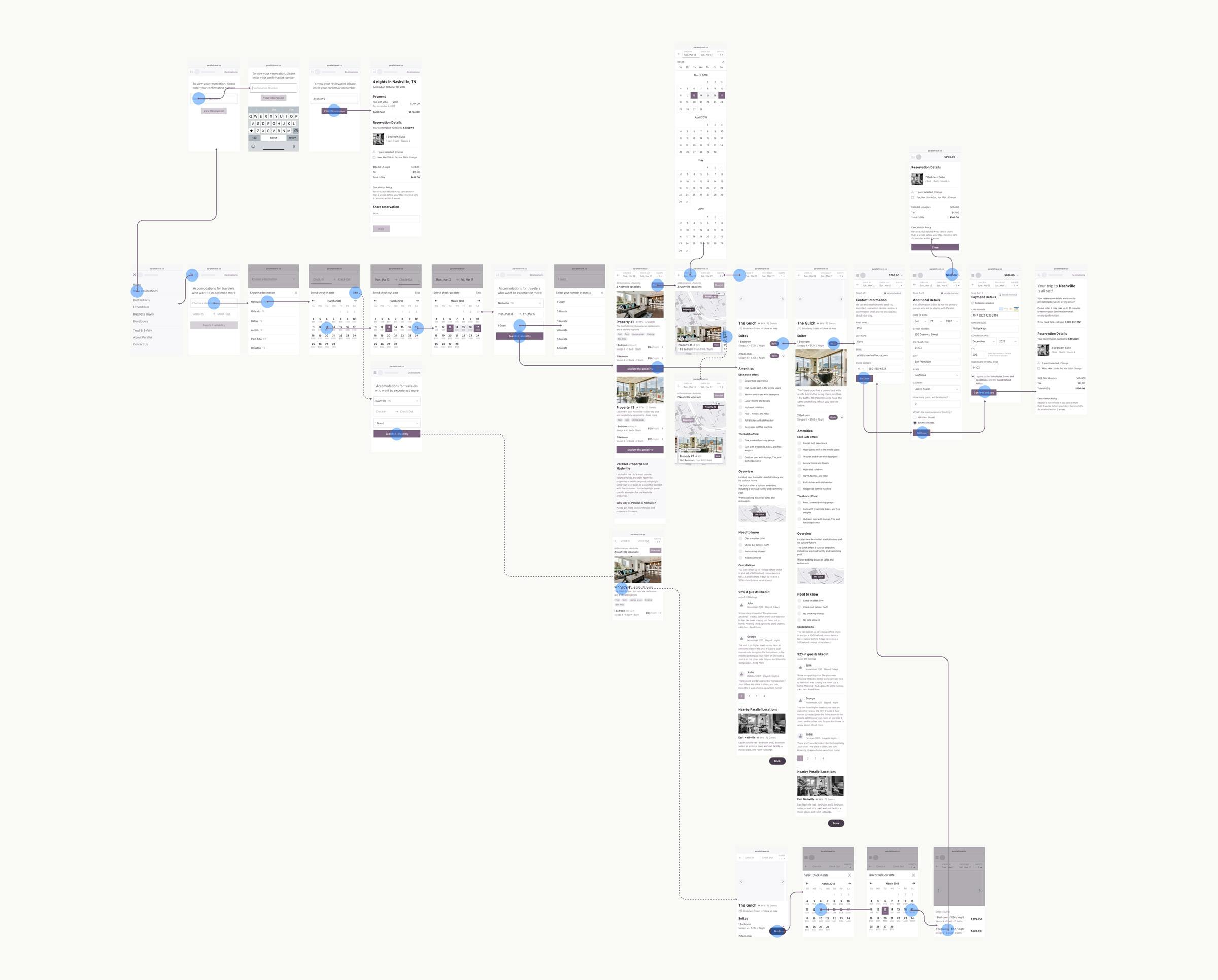
Bird's eye view of mobile flow
Booking flow wireframes
Here's a close-up of the desktop booking flow. As you can see, the goal wasn't to define the end UI but provide a general direction for the overall flow & general interface.
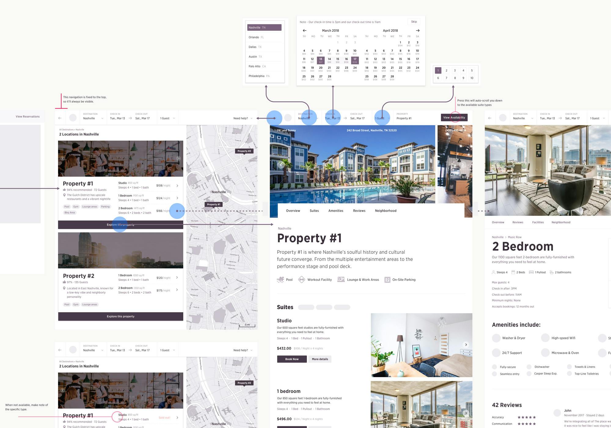
Close-up mock examples
The above mocks show the two most challenging pages: search results and individual building pages. For both, figuring out the most important content to highlight and in what order took time. With each mock-up we created, we'd wire up a prototype and speak with business travelers to see what caught their attention, what types of questions came to mind, and what information was missing causing friction.
There was an understanding that we could only move the needle so much with these mocks. Once we reached a certain confidence level, we felt comfortable moving into more refined UI and development, knowing we could continue experimenting as the site went live.
Marketing page mock-ups
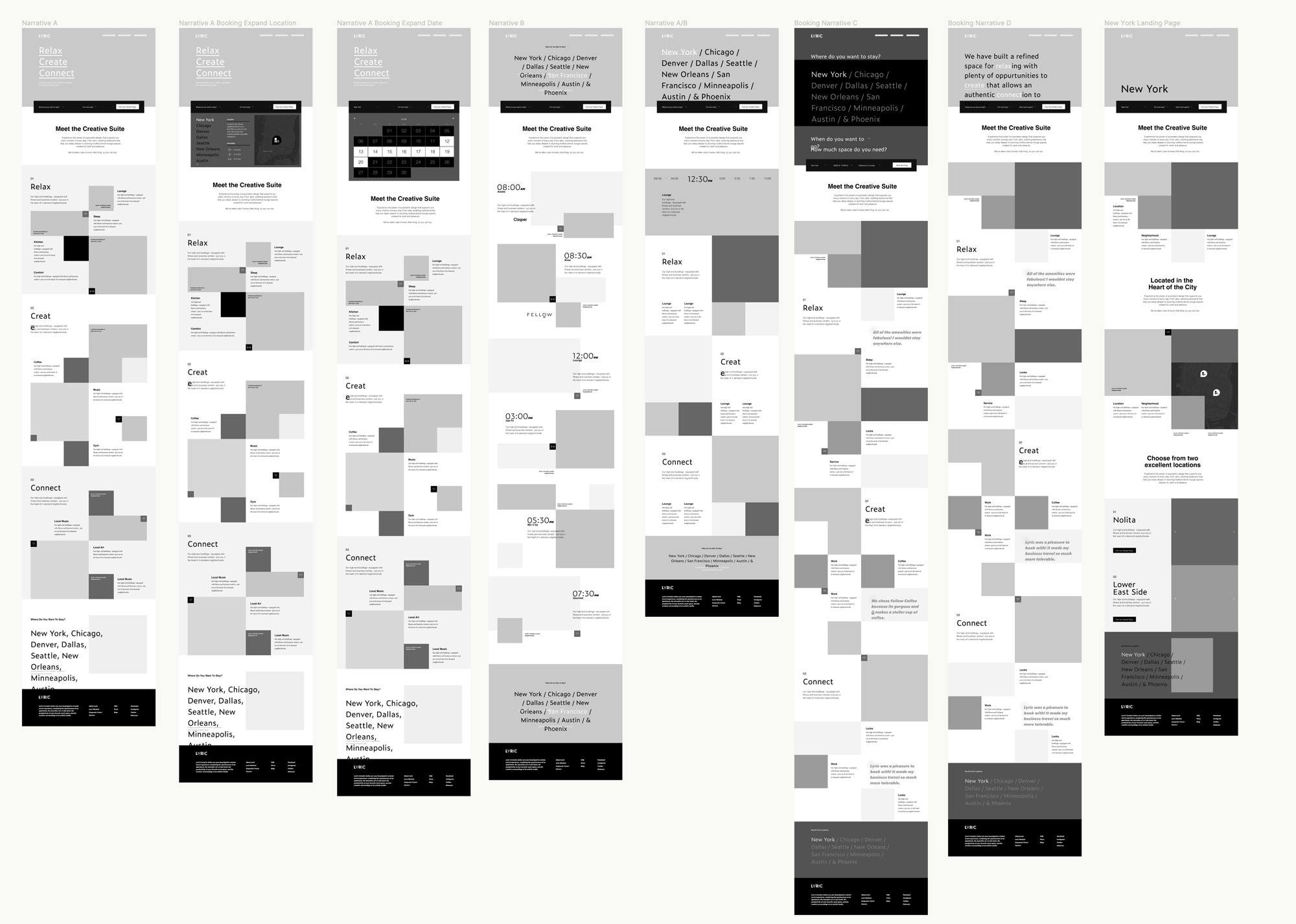
Homepage mocks
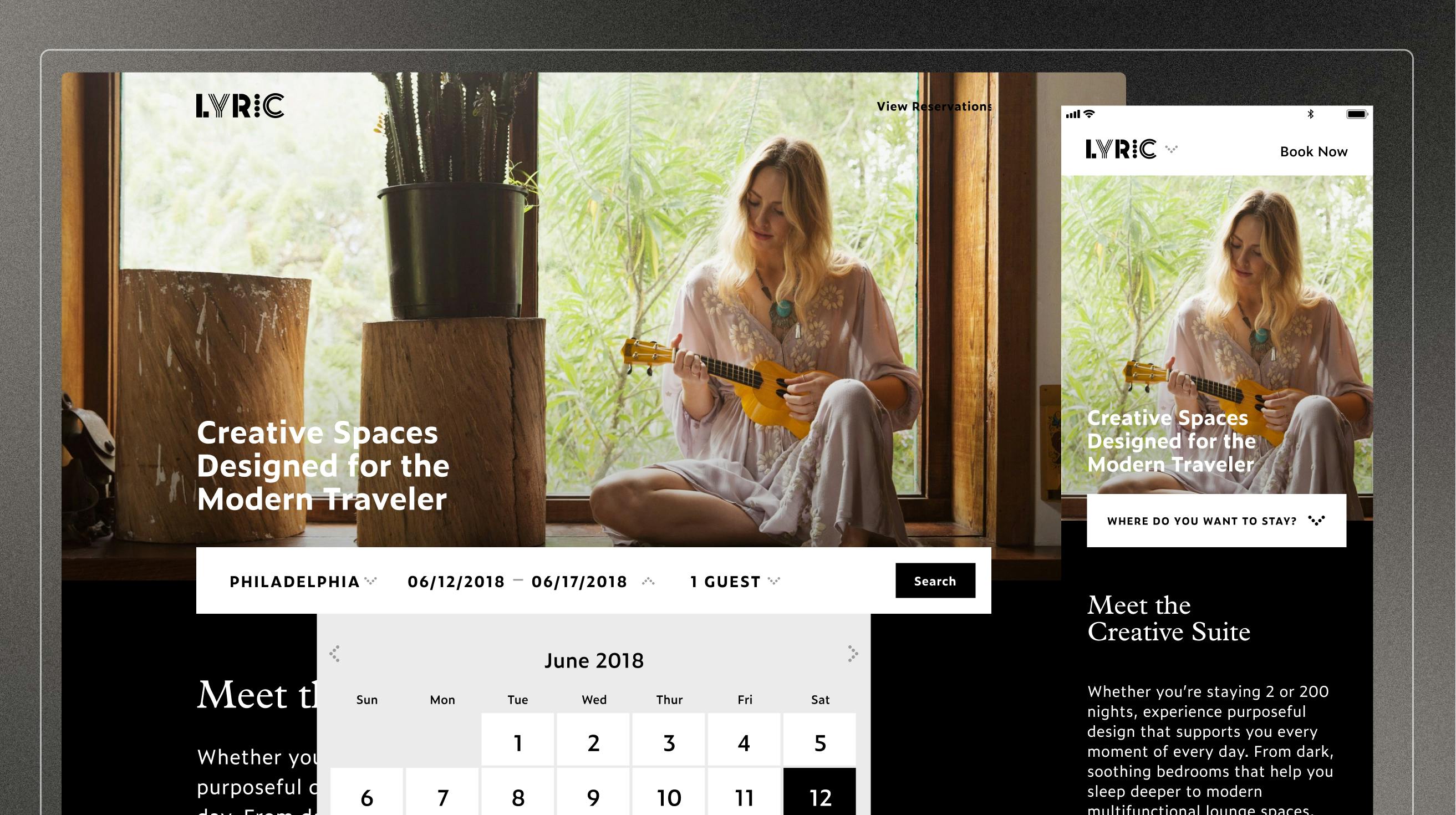
We reached a point with the mocks, both for website pages as well as booking flow where we had a confidence level to move into refined UI and development. That being said, there was still room for some more experimentation at key points like search.
Brian, a fellow Lyric product designer, took the project lead at this point. Working with Ravi, Michael, another brand designer and the engineers he connected the mocks to the brand identity, and set everything up for engineering.
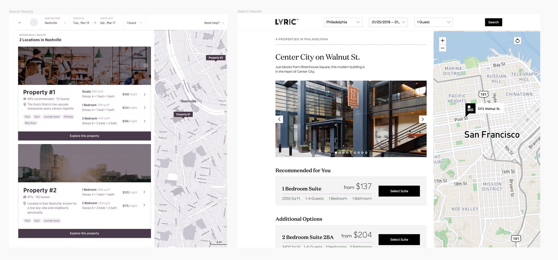
The before and after of the search results view
Final deliverables for engineering